When creating a new website, or refreshing an existing one, most people remember to tackle the big things. Identifying groups of potential web visitors (customers, potential customers, donors, employees, investors, partners) and the information they’ll need. Designing an inviting and visitor-friendly layout with beautiful photos or graphics. Crafting compelling copy that tells visitors you “get” them – you know who they are, understand their needs and can help solve their challenges.
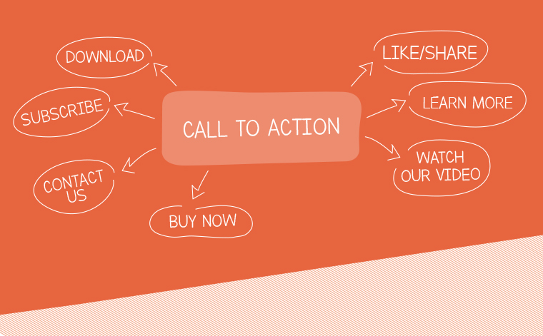
Yet few people remember this big thing: calls-to-action. A call-to-action (CTA) is text or image that invites, or “calls” visitors to take “action” or do something specific. The CTA can be for anything: register for a seminar, download a white paper, watch a video, donate money, learn more, etc.
Great CTAs encourage visitors to stick with you, to take the next step in getting to know you and your business. Forgetting to add CTAs to your website is a missed opportunity. Bad CTAs are even worse; they can alienate visitors who might otherwise be perfect customers, simply because you didn’t give your CTAs the time, attention and design they deserve. And good CTAs can double your response rates.
Whatever you do, don’t forget to ask for something. Calls to action are often the beginning of a beautiful relationship. But if you don’t ask, you may never know. Make it easy for prospects to stay interested. Ready to create or refresh your CTAs? Here are four sure-fire ways to engage with powerful CTAs.
STEP ONE: Identify Next Steps
Start by understanding your audience. Who are the people who visit your website? What do you know about them? What brought them there? What are they looking for? How can you help them now? What do you want them to do?
The exercise is similar to planning a party. Who’s coming? What do you want to be able to offer them when they arrive and throughout their stay? You’re really planning a series of CTAs for your guests. You’ll want to invite them into your home (“Please, come in!”). You’ll store their outerwear (“Let me take your coat.”). And offer them refreshments (“Would you like beer, wine or soda?”).
Once you have your web guests in mind, brainstorm and document how you can help and what you want them to do next. Write your ideas in the form of basic CTAs. Learn more about our company (or our products, about our services). Browse our customer case studies (our white paper library, our newsletter archive, etc.). Sign up for our newsletter (for a webinar, for a demo). Download this handy tip sheet.
Plan ahead to be sure you have, or can create, something of value for each targeted visitor while they are on your website.
STEP TWO: Make it Easy
When you host a party, you automatically plan with customer comfort in mind. Umbrella stands at the front door on a rainy night. Plenty of comfortable seating and conversation spots. Vegetarian options on the menu. Planned introductions for people with similar interests. You take all these steps to make it really easy for guests to enjoy the evening.
The same should be true for your web visitors. Make it really easy for them to find and consider your CTAs. Make them:
- Easy to find. CTAs are most often presented as buttons on the web page or within a call-out box. Use colors that contrast with the background, so they stand out on the page.
- These days, CTAs often appear as “pop-ups” on a webpage. We don’t recommend using this approach when someone first gets to your page, since the pop-up may be a frustrating obstacle to the content they came to read. However, a pop-up CTA as someone is leaving a page may be welcome. If your content is valuable and you’re offering a newsletter subscription, with access to a content library or useful template, for example, a visitor may be ready for the next step.
- Easy to read. Use short phrases. Be sure the letters are large enough to read, with white space around the words and the button, so guests can easily read your invitation.
- Easy to understand. When helpful, use photos, illustrations or video to supplement the words. Avoid adding too much copy. To promote recent survey results, for example, use a photo of the report cover, a very simple infographic or a short (10-15 second) video to tease the results. Use a short description like, “Unlock the power of Millennials in your workplace” or “Here’s how 300 executives rated their Millennial leaders.” Then add your specific CTA: “Download Insights,” “View Summary” or “Watch Highlights.” Remember, you can have a second CTA from the infographic or video to invite viewers to download the full report.
- Easy to say “yes.” Be sure the CTA is in line with what your visitor needs and how well they know you. Invite homepage visitors to “learn more” about your products, services or company. When someone downloads a white paper, invite them to “sign up for our newsletter.” Once someone reads through your Services page, invite them to “read this case study” or “sign up for a demo.” Think about how you can add value at each step of a customer engagement.
STEP THREE: Make it Compelling
An invitation to step into the living room to warm by the fire will generally be accepted on a chilly evening, but declined on a hot summer day. The offer of an extra ticket to a baseball game or opera performance can fill a person with joy or dread, depending on their interests.
Be sure your CTAs are valuable and appropriate for your audience. Sometimes, a nudge or incentive will help an interested party take action now.
- Show Benefit. Try to make the benefit clear, particularly if it is a problem they are trying to solve. “Become a better manager.” “Improve your skills.” “Stay ahead of your competition.” “Gain industry insights.”
- Ensure Value. Be sure your offer is good enough. We’re all busy and inundated with demands on our time and energy. For your visitor to act, your CTA must be something that’s worth their time and willingness to give up their name and email address.
- Include an Incentive. By offering a free gift, exclusive content or a discount, more people will act right away.
- Be you. Part of being compelling is embracing your brand. If you are business that surprises and delights its audience, have some fun with the language. If you are conservative law firm, get to the point. The point is, use your voice.
STEP FOUR: Follow Through
Any host knows that the party isn’t over until all the guests are safely home. They take responsibility for the full experience.
Your CTA isn’t over until your web guest receives what you promised. It’s up to you to ensure that the experience is a good one.
Test the download feature to confirm that the visitor gets your white paper right away. Confirm subscriptions with an instant confirmation email, so they know their information was submitted correctly and that they will start receiving your next newsletter. Be sure that everything on the landing page works – the calendar to schedule a demo, the video player, the donate process.
When these things don’t work, you’ve wasted their time and a potential opportunity to gain a new customer. At exactly the moment you intended to delight someone, you’ve failed them.
Conversely, when everything goes as planned, congratulations! You and your web visitor are one step closer to building a mutually beneficial business relationship.
CTA Inspiration for You!
It’s okay to show your personality. Please do. Anytime you make an emotional or human connection, you’ve cleared a hurdle. Here are several clever CTAs from brands with great personalities.
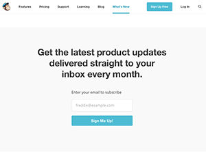
 MailChimp writes in a conversational, easy-going style. They will make helpful suggestions with their buttons like “Try it out.” or “Sign me up!” Their style is friendly and encouraging.
- Evernote. Remember everything. It’s a simple, powerful promise. Followed by two sentences that quickly emphasize benefits while describing the service. And a clear CTA: “Create your free account.”
- Basecamp. This online project manager app uses an illustration to connect harried professionals with the feeling of being overwhelmed. Busy professional? Basecamp “gets you” and instantly reassures and welcomes you with “We’ve been expecting you.” As if using their app is an inevitable solution to your problems. “Try Basecamp for FREE” makes it easy to say “yes” and take the next step.
Ready to refresh your website with compelling CTAs? Contact our experts today! We’d be happy to help!

