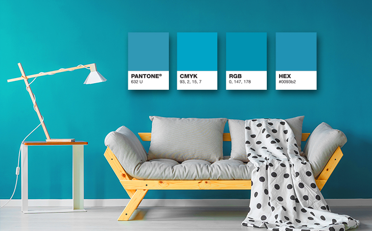
Some of the biggest brands in the world are immediately identifiable by color association alone. Think Starbucks green, Target red, UPS brown. These brands have made color a critical element of their process, a key consideration in their outreach efforts, and consistency across platforms, materials and devices is critical. Even for small and mid-size B2B companies, consistent color can work to your advantage. So how do you make sure you’re getting color right?
insight180’s Favorite Valentine’s Day Messages
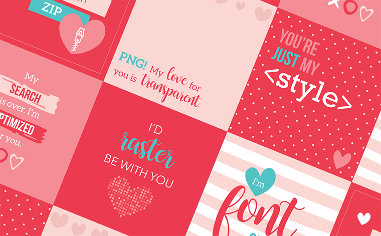
Spread a little love today! We can’t resist those sweet, corny love-inspired messages on Valentine’s Day. In years past, we’ve helped spread the love from a “maker- perspective” — with design-, type-, color- and code-inspired love notes… after all, those are some of the tools we use every day. Here are eight of our favorite messages from 2017 and 2018 as well as two new ones for 2019 for you to share. Just click on the image to share directly to Facebook, and tag the one you love.
Save Your Images! The How-To Guide of High vs. Low Resolution
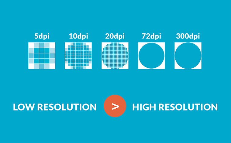
So, after my two-part series on file formats, File Types: Which One is Right for Me? and Vector vs. Raster? How To Choose The Right File Format, I realized I should probably elaborate on another key aspect of determining which files will work best for a project: high resolution vs. low resolution. This is the final key element in choosing the right image for your assigned task.
Made with Love: Six Design-Inspired Valentine’s Cards
“We think you’re fontastic, Valentine!” Valentine’s Day is always filled with cute, corny puns targeted for anyone. We love receiving them, reading them and (most importantly) creating them! Here are six Valentine’s Day graphics made by insight180 for you to enjoy and share with your Valentine! By special request, we’re including the 2017 “designer” Valentines that inspired us to spread the love even more.
File Types: Which One is Right for Me?
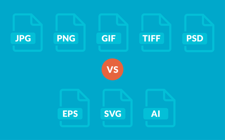
In my last blog, I addressed the first hurdle in helping you decide “Vector vs Raster? How to Choose the Right File Format.” In this article, I will take it one step further and help you choose the right file extension for the job from each of the two categories.
Vector vs. Raster? How To Choose The Right File Format
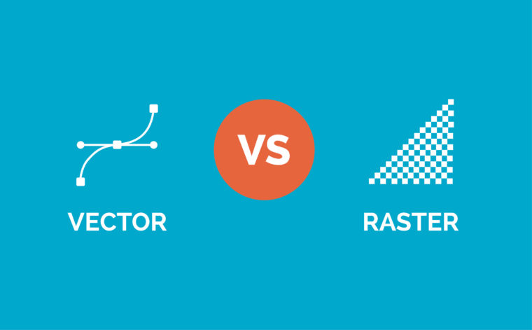
You’ve seen it before. “Fuzzy” looking edges, logos that have been distorted and stretched in a Word document or PowerPoint, blurry images. These are telltale signs of a problem we encounter often . . . vector vs. raster confusion. As an art director and designer, one of the most common problems that I run into when working with other people’s files (especially logos) is that the files are not optimized for their specific use. And, yes, it can be confusing! So we wanted to use this blog post as an opportunity to help educate readers on the differences between the most used file formats and when to use them. Using the right type of image file, you can make sure your audience views crisp, clean and beautiful looking materials.