

Brand Identity: Fitness and Medical Exercise Logo

New way to map streets – with logos

I came across this idea on the blog, Brand New, and was instantly compelled to check it out. Basically, it is a map made up of logos. Although this concept is fairly new, I think the idea behind it is amazing and they do such great job of pulling it off. As a designer, I know it is hard to make a collection of different logos look good when they all need to be placed in such a small area. But the company that creates these maps, CityMaps, achieves it beautifully.

Brand Identity: Elie Elie Salon Logo

Brand Identity: BioStats Website

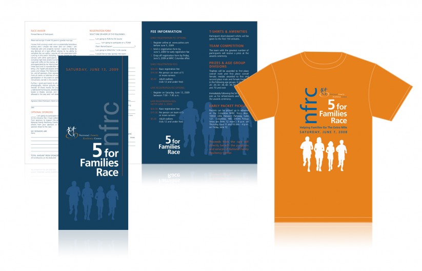
Brand Identity: NFRC Logo, Print Materials and Emailer

Brand Identity: The Harbinson Group Logo

Brand Identity: Rugs to Riches Logo

Brand Identity: Prologue Logo

World Cup: Vancouver Whitecaps
Being that we are in the middle of the World Cup and that the United States just beat Algeria to advance to the next round I thought this was the perfect time to look at the new logo for the Vancouver Whitecaps. For those of you who don’t follow soccer, the Vancouver Whitecaps are a new addition to the MLS (Major League Soccer). They have been around since 1973 but 2011 will be their first season with the MLS, so I think it is only appropriate that they’ve engaged in rethinking their image, and after careful introspection, have re-branded themselves. The goal was to have a clean and efficient look that could stand up to all sorts of mediums and I personally think it is a success. I like the simplicity of the new logo and it’s defined look. It doesn’t give into the current trend of sports logos using a mascot to sell the brand, it takes a risk. It lost the original “cartoon” feel and became more simplistic and shield-like. Also, it has a lot of symbolism which gives it strength. This blog quote explains it best:

Brand Identity: Winemasters Logo


