Often, it’s the little things, the ordinary, the unexpected encounters that spark our imaginations. A surprise find can lift us and elevate whatever comes next. That’s certainly true for our insight180 team. We’re delighted to share just a few of our Fun Finds with you here. Enjoy exploring what caught our attention. We’re hoping some of our discoveries will inspire you, too.
Icons in Motion. (Bethany)
I love icons! I think they are fun and help to tell a visual story without requiring actual photographs. Icons are powerful, universal, a fun way to bring emphasis to something without being overwhelming and bulky. And that is why I chose Dan + Shay’s Icon Videos as my “fun find” this quarter. I love that they tell a story. Check out this one for their hit called “Keeping Score,” featuring Kelly Clarkson.
Watching this makes me smile. Although anyone can use an icon, it is really easy to use them wrong. The fluidity of this video shows how the right choices can make something so simple look amazing and very powerful. I also love that the video illustrates the key point that “icons should almost always be accompanied by a label”. In this case, it is lyrics instead of text that help to create a meaningful link between the icons and the message behind the song.
The Hashtag Blues. (Nastasia)
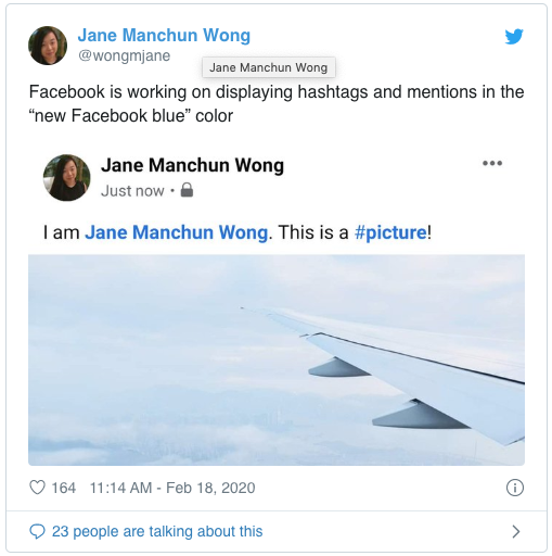
This Social Media Today article shares one of the latest visual ideas Facebook has brewing. Facebook is experimenting with displaying hashtags and mentions in a “new Facebook blue” color. Currently, in a Facebook post, a hashtag or mention is bolded but still remains black. Both LinkedIn and Twitter highlight tags and hashtags with blue text color. Facebook has the option of changing some text colors such as “Congratulations” or “Happy Birthday” in posts. Andrew Hutchinson, the author of this article, believes, “Facebook might find that by highlighting hashtags and mentions more clearly may lead to more engagement.” Since Facebook is always evolving, it will be interesting to see how Facebook users respond if they do end up launching this idea.
NASA Posters Are Outta This World! (Elizabeth)
For Christmas this past year, my 19-year-old asked for “vinyl” of his favorite rapper. He was undaunted by the fact that our ancient turntable was boxed up in storage. He cared more about displaying the cover art on his wall. I kinda loved that the music technology of my childhood is finding a place in today’s digital music world.
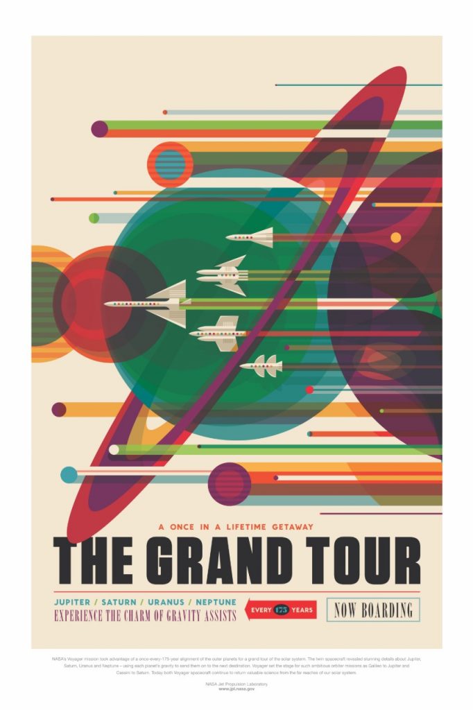
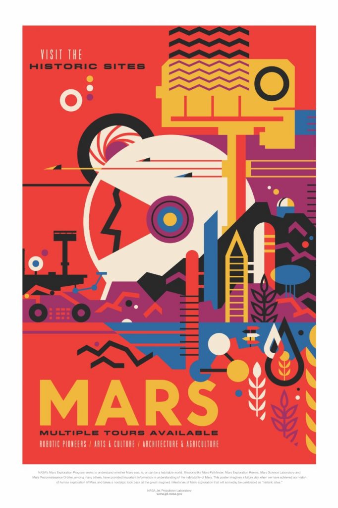
I feel the same way about my fun find for this quarter: NASA’s Visions of the Future poster series celebrating the “edge of possibility” for space and space travel. Though we are not (yet) back to the booming space exploration agenda of the 1960s, NASA, SpaceX, Virgin Galactica and even the much-anticipated U.S. Space Force are capturing headlines and enthusiasm across our country and beyond. Hats off to NASA/JPL for celebrating the next frontier of space exploration with these bold, artful posters that speak to the imaginations of today’s generations.
Explore them! Enjoy them! And download them (for free) to display on your own wall.
The Energy of Color. Why We Like What We Like. (Nikole)

I’ve always been a “green” girl. Love any shade of it. In fact, even my birthstone is green! One of my dearest friends loves blue. However, I never got it with blue. Great for the ocean and the sky but not on me or in my house. I started thinking, I wonder why that is? Why do I have such a positive reaction to green and such a “meh” one to blue? I found this article, “Why Am I Drawn to Certain Colors?” that I think does a great job of explaining the “energy” of color and the individual properties of each. It also talks about how to restore balance with different colors. So cool!
The Beauty of Clever Copy. (Wendy)
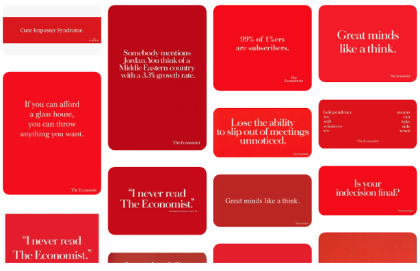
I love clever copy. Especially the kind that makes an impact with one great headline. Whenever I’m in need of a bit of brand messaging inspiration or I’m struggling for just the write words, I look up some of the classics of the past: Volkswagen, Nike, Ikea, Apple come to mind. But my favorite, probably, in terms of wit, charm, and irreverence, are the simple headline-only ads from The Economist. Signature red background and reversed white type. Unencumbered by an image. With play-on-words phrases like: “Shine and rise.” “Where guesses become educated.” “Great minds like a think.” Each is simple and complete and makes you take a second look (branding at its finest). For more, Search Economist ads on Pinterest.
Check back in a couple of months to see more “Fun Finds!”
[/vc_column_text][/vc_column][/vc_row]

