So much has changed in the past year. New things are catching our eye. The insight180 team has once again gathered a few design-inspired items that capture some of the movements and moments of today. From Disney World and the Olympic logos to generational aging trends and post-pandemic design trends, we hope these creative “finds” bring you some enjoyment and inspiration. What’s something you’ve been noticing?
“Doing Good” Design & Other Post-Pandemic Design Trends (Wendy)
Trends in graphic design and branding run the gamut and are indicative of what we are experiencing in the world around us. After a somewhat tumultuous year (+) of navigating through a pandemic — one marked by disruption, isolation, racial inequity, and uncertainty — it’s not surprising that some of the trends that rose to the top have been calming, reassuring, and sweet. What we have seen also runs the gamut. From friendly, playful, optimistic designs with bright colors that ooze kindness, joy, and “upliftedness” to authentic, soothing, nature-focused designs. Patagonia, a brand known for its social responsibility and environmental activism, leads with “feel good about doing good” headline.
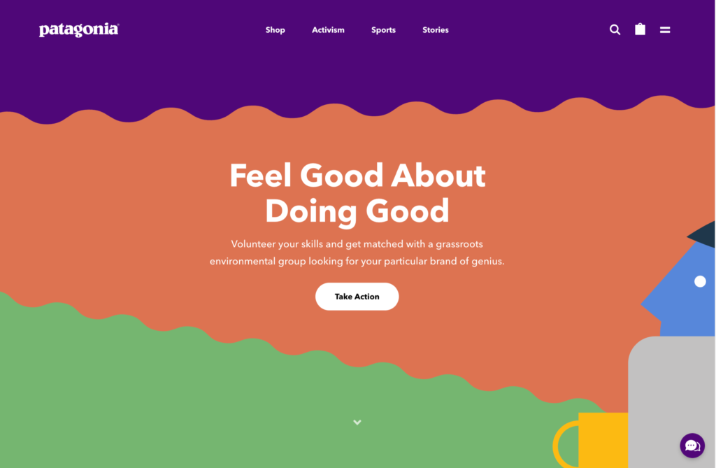
Many brands are demonstrating a newfound appreciation for the environment, nature, and the outdoors and some of the color palettes and organic shapes emulate that. We’re also seeing trends in more sustainable, natural-looking, and often less, packaging. We’ve seen much focus on wellness, doing good, sustainability, and socially responsible companies, products, and design. Creative Boom shares a great compilation. I love seeing authentic, honest, less-than-perfect brands. The past year reminded us how important it is to connect with others (and with nature and ourselves) but to do so in a way that is true. Raw, real, powerful graphics with meaningful and socially aware messaging and branding.
Olympic Logos (Nastasia)
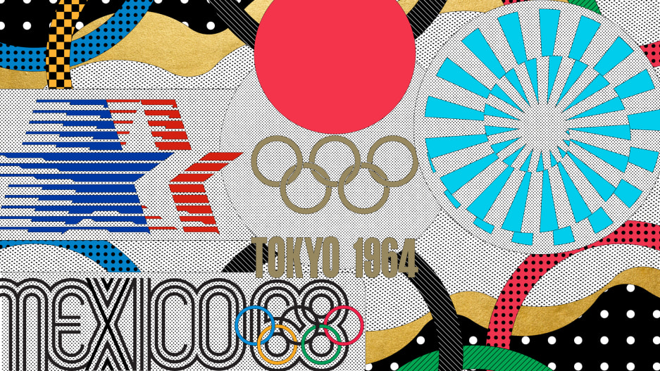
The summer Olympics were Jul 23, 2021 – Aug 8, 2021, and boy, were they exciting! The Olympics have produced some of the most exciting brand identities of the past century, long enabling host cities to communicate their hopes and ambitions to the world through their official Olympic logos. The best are like a welcoming committee, enticing viewers to learn more. Fast Company asked six prominent designers to identify the greatest Olympic logos of all time. Their picks range from Wyman’s iconic 1968 branding to Tokyo’s other (decidedly more successful) logo for the 1964 Games. Take a look and let us know what you think! What’s your favorite?
Generational Aging Trends (Elizabeth)
For a number of years, I’ve been hooked on learning about the generations. As a marketer, I love discovering the behaviors, lifestyles, and preferences of Baby Boomers, Generation X, Millennials, and Generation Z – and how those differences drive changes in our world. For example, when listening to this recent Planet Money podcast on the “Three Reasons for the Housing Shortage,” I was fascinated to learn about the role of Baby Boomers in this trend. Boomers are a large population. They are living longer. And, unlike previous generations, Boomers are choosing to age in place, rather than sell their homes and move to smaller accommodations. The housing market didn’t anticipate these realities, which now contribute to our current housing shortage.
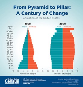
What’s truly interesting is the aging trend beneath the housing trend. For the first time, there are now more people age 65 and older than under 5 years old. The U.S. Census Bureau has predicted that, by 2034, there will be more people aged 65 and older than under the age of 18. This is a big shift with long-term effects. Each generation will have a longer, more sustained, impact on housing – and nearly every other industry. Take a look at this simple chart that elegantly brings this prediction to life. And start planning now for the rest of your long life!
Magic of Disney (Bethany)
I just got back from Disney World last week. It may not be everyone’s favorite choice of vacation spots but with little kids, Disney is a must-do, especially if you have a little girl in the house who loves princesses! I have to admit that I wasn’t really that excited for this trip, but the “magic” of Disney is truly contagious. I loved it all.
Disney’s attention to detail is amazing, especially for a company that has so many well-known parks each with their own identities, which are all a part of their brand. It isn’t easy making it all seem part of a cohesive unit or experience but somehow they pull it off effortlessly.
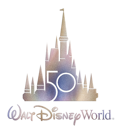
This is Disney’s 50th year and they are kicking it off with a big celebration starting October 1st, and a recently revealed 50th-anniversary logo! It is full of sparkle and reminds me of the “magic” they bring to all of us when we step inside their gates. I like how they stayed true to their brand with the iconic type and castle that has been prevalent in their logo over the years. Watch this video to see how seriously they take their – you’ll see how the colors all mimic the tone of the new magical anniversary logo. They are even adding the logo to Cinderella’s castle and are somehow going to incorporate the iridescent sparkle onto the castle itself (not to mention sparkly magic bands, specialty treats, shiny character costumes, balloons, and more are rumored to be coming soon)! So keep your eye out on the changes if you are headed to Disney soon; and if not, you can check out this blog highlighting everything happening as part of the celebration.
Check back in a couple of months to see more “Fun Finds!”

