Blog : design

How to Navigate the World of Color for Your Brand

How to Navigate the World of Color for Your Brand

Some of the biggest brands in the world are immediately identifiable by color association alone. Think Starbucks green, Target red, UPS brown. These brands have made color a critical element of their process, a key consideration in their outreach efforts, and consistency across platforms, materials and devices is critical. Even for small and mid-size B2B companies, consistent color can work to your advantage. So how do you make sure you’re getting color right?

READ MORE
Save Your Images! The How-To Guide of High vs. Low Resolution

Save Your Images! The How-To Guide of High vs. Low Resolution

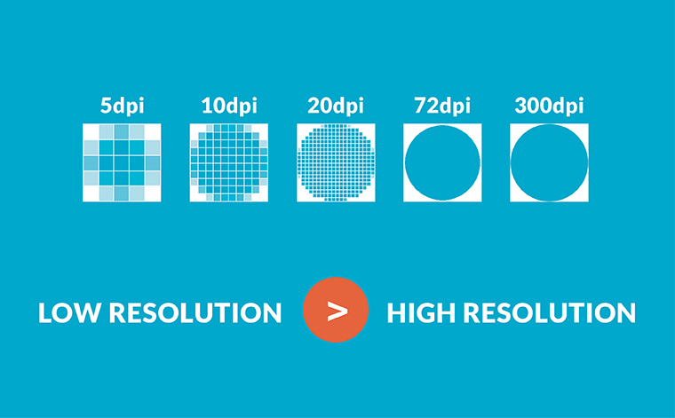
So, after my two-part series on file formats, File Types: Which One is Right for Me? and Vector vs. Raster? How To Choose The Right File Format, I realized I should probably elaborate on another key aspect of determining which files will work best for a project: high resolution vs. low resolution. This is the final key element in choosing the right image for your assigned task.

READ MORE
Made with Love: Six Design-Inspired Valentine’s Cards

Made with Love: Six Design-Inspired Valentine’s Cards

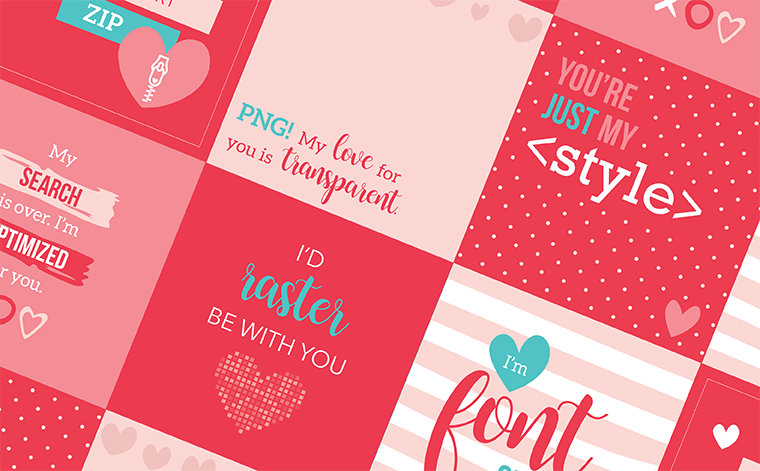
We think you’re fontastic, Valentine!” Valentine’s Day is always filled with cute, corny puns targeted for anyone. We love receiving them, reading them and (most importantly) creating them! Here are six Valentine’s Day graphics made by insight180 for you to enjoy and share with your Valentine! By special request, we’re including the 2017 “designer” Valentines that inspired us to spread the love even more.

READ MORE
Social Media Dimensions Made Simple: Your 2018 Blueprint

Social Media Dimensions Made Simple: Your 2018 Blueprint

Social media is ever-changing. The networking platforms’ newsfeed algorithms are constantly updated. Topic and engagement trends evolve quickly. And because social media platforms are frequently updating their layouts, recommended dimensions for profile, cover and other images change on a whim.

READ MORE
Vector vs. Raster? How To Choose The Right File Format

Vector vs. Raster? How To Choose The Right File Format

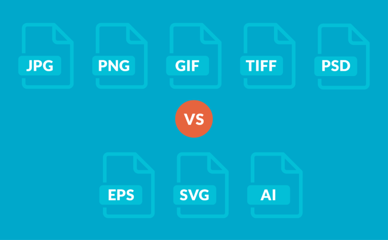
You’ve seen it before. “Fuzzy” looking edges, logos that have been distorted and stretched in a Word document or PowerPoint, blurry images. These are telltale signs of a problem we encounter often . . .  vector vs. raster confusion. As an art director and designer, one of the most common problems that I run into when working with other people’s files (especially logos) is that the files are not optimized for their specific use. And, yes, it can be confusing!  So we wanted to use this blog post as an opportunity to help educate readers on the differences between the most used file formats and when to use them. Using the right type of image file, you can make sure your audience views crisp, clean and beautiful looking materials.

READ MORE
Key Words and Tweets and Blogs, Oh My!

Key Words and Tweets and Blogs, Oh My!

We are inundated with more than 2000 marketing interruptions per day – whether it be print, radio or TV advertisements, emails we need to sift through despite our filters, banner ads on the websites we visit, billboards we pass on the way in to work. It is a very crowded marketplace and it gets more and more challenging to get your message to your potential customer. So why not allow them to find you more easily? This is the premise of “inbound marketing” – using Google, social media outlets, blogs and other methods to get people to find you. We recommend two excellent books on the topic: Inbound Marketing by Brian Halligan and Dharmesh Shah (founders of Hubspot), and Twitter Marketing: An Hour a Day, by one of our colleagues (and clients) Hollis Thomases, owner of Web Ad.vantage. While the adage “It’s not what you say, it’s what others say about you” is true to a large degree, we would also argue that you had better, indeed, have something substantive to say. You can tweet and blog and reference key search terms ’til the cows come home, but if potential clients land on your website and find little relevant content, a cluttered or crowded site, or an amateur design, you can be sure that they won’t come back. While Halligan and Shah devote a chapter to creating remarkable content, they don’t emphasize enough about the importance of branding and design.

READ MORE