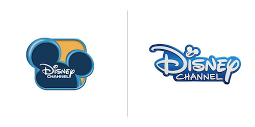
Check out these logo design changes for June 2014.
Disney Channel

Contrary to our post about the, “Less is more” logo trend, Disney has given their logo a refresh but, has yet to adopt a flat design. With the type logo no longer surrounded by the box and mouse ears, Disney opted to make the ears smaller and incorporate it into the type logo itself. I think this makes for a much cleaner, distinctive, high quality logo.


