Opening Day at Camden Yards
For Orioles’ fans, opening day in Baltimore is like Christmas come early, and this year’s opening day did not disappoint. While the few weeks running up to opening day were snow ridden, March 31st brought warmer weather for Orioles and Red Sox fans alike. With the O’s victory over the Red Sox (2-1), many believe this could be Baltimore’s year.
The Baltimore Orioles Cap
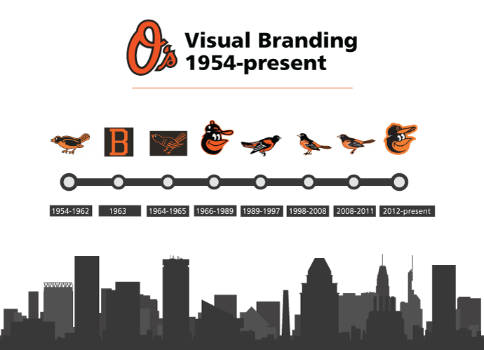
Logos Through the Years
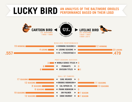
The Orioles have gone through their fair share of logos over the years, but does the Orioles visual branding have anything to do with their success? Does a team perform better because of their logo? That sounds pretty illogical… but this breakdown suggests that there may be a correlation. Pair this with the O’s success since the New Cartoon Bird logo they’ve had since 2012, and it seems downright creepy.
Design-success superstition theories aside, lets take a look at some of the O’s visual branding over the years.
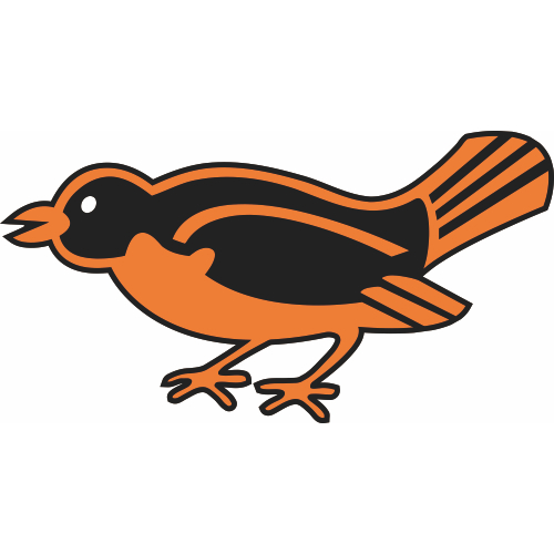
The Lead-Off Bird (1954-1962)
For their first nine seasons, the Orioles’ hats featured the Lead-Off bird. With this logo, Baltimore only managed two winning seasons.
The Orange “B” (1963)
The only season that the O’s were birdless, 1963 brought The Orange “B” to the team. After finishing the season 18.5 games behind American League Champion New York, the O’s knew it was time to drop the “B” and go back to the bird.
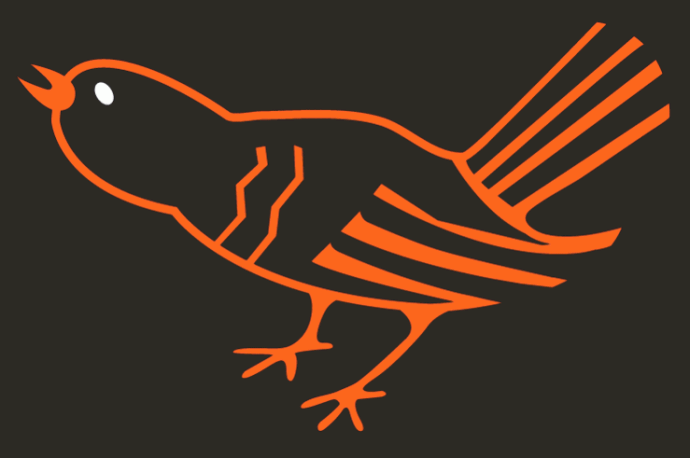
The Chirping Bird (1964-1965)
By 1964, the bird was back and the Orioles finished 3rd in the American League with a record of 97 wins and 65 losses, two games behind the American League champion, the New York Yankees.
The Cartoon Bird (1966-1989)
The age of the Cartoon Bird was the O’s most successful era. With 19 winning seasons, including seven trips to the American League Champion Series, six pennants and three world series championships, the O’s were known as the winningest baseball team during this time.
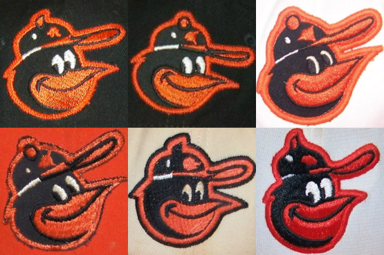
The Cartoon Bird wasn’t only a symbol of the winningest time, it was also the most varied. In an interesting post on the MLBlogs Network, the variations of The Cartoon Bird are shown and it changes slightly over the years. These hats were also made by different companies between 1966 and 1988 so that is most likely a large factor in the variation.
(via cartoonbird.mlblogs.com)
The author of cartoonbird.mlblogs.com wrote a very in-depth article about the differences between the Orioles Cartoon Bird variations over the years and elaborated on these six variations.
Top-Bottom, L-R:
- 1966-1974 – This is the logo you see most often on the black crowned caps. I think it’s pretty safe to call this one THE ’66-’74 cap logo. Made by Wilson.
- 1974 – This logo seems to show up on the last year of the black crowned caps in ’74. This same basic design would remain on the caps through the transition to the white and orange panels. Also made by Wilson.
- 1975-1978 – Logo used on both white and orange panel (’75-’76 only) alternate. Made by AJD.
- 1975-1976 – Logo used on both white and orange panel (’75-’76 only) alternate. Made by AJD.
- 1977-1978 – Made by Roman Pro.
- 1979-1988 – Made by New Era.
(via cartoonbird.mlblogs.com)
The Ornithologically Correct Bird (1989-1997)
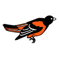
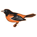
After 23 years the Orioles traded their iconic Cartoon Bird in for a more realistic representation of our state bird. The new Ornithologically Correct Bird adorned the O’s hats from 1989-1997 and is associated with failure.
The Lifelike Bird (1998-2008)
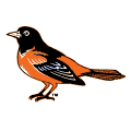
Not unlike The Ornithologically Correct Bird, The Lifelike Bird was also known for failure. The O’s were not able to record a single winning season within the ten year span.
The Traditional Bird (2008-2011)
A simpler and slightly different version of The Lifelike Bird.
The New Cartoon Bird (2012-present)
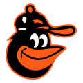
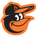
In celebration of the 20th anniversary of Camden Yards, the Orioles updated their logo with a modernized version of the first Cartoon Bird. If you believe that great design and nostalgia can work together to make “Orioles Magic,” you may be right. With the updated logo came new life for the O’s. In the first season with the updated logo, the Orioles finished above .500 for the first time in 14 seasons, as well as won the inaugural Wild Card Game. The following season, the team failed to make the playoffs, but finished above .500 for the second-consecutive year (via Camden Chat).
For more Orioles visual branding throughout the years, check out this photo gallery on the Baltimore Sun’s website.


