While these styles have been around in some way or another for a while, here are some trends in graphic and web design that we think will be bigger than ever in 2015!
Flat Design
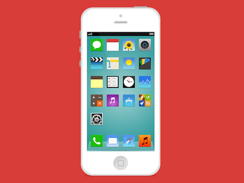
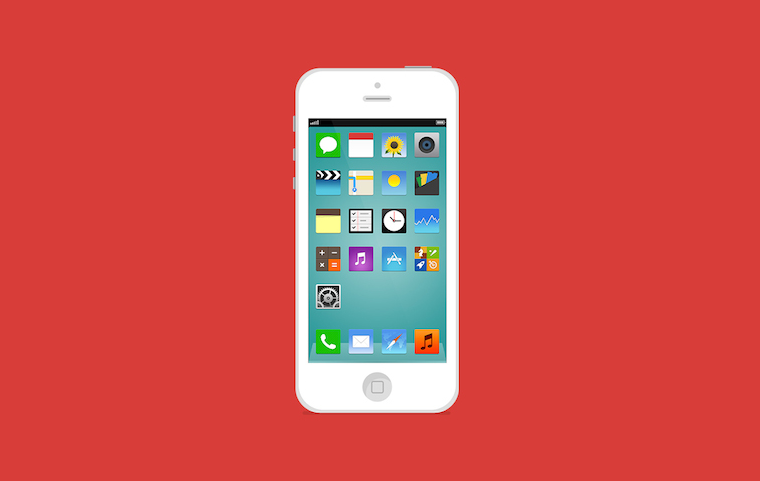
If you’re a designer or work alongside them, you’ve undoubtedly heard that flat design is trending right now. While flat design draws its influence from various styles of art including: swiss style, minimalism and the styles emerging from Bauhaus, it can be said that it was Apple’s 2013 release of IOS 7 that really made flat design “mainstream” (thanks Jony Ive!).
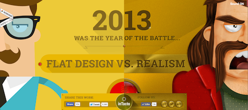
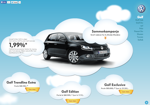
One creative project that really shows the difference between flat design and realism is creative agency Intacto’s interactive infographic.
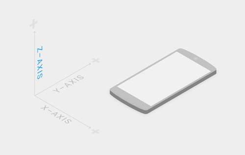
Similar to (or maybe even the same as) flat design is Material design – Google’s attempt to write the rule book on interactive design. Material design can be described in a few ways:
- Not just a style, but a way of thinking about designing interfaces
- A new way of understanding user interfaces where elements are stacked like physical objects in a 3d space (treating pixels like paper).
- An attempt to unify all of Google’s products
Read Google’s Material Design Guide and decide for yourself.
Full Screen Background Images & Videos
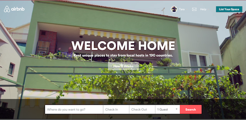
Full screen background image or video was one of the major design trends for 2014. A great example of full screen video done flawlessly is airbnb.com. In a matter of seconds you’ll travel around the world via short videos, to different cities, through various kitchens, living rooms and bedrooms by way of boat, canoe, and mobile home. These short slices of life immerse you in Airbnb’s brand and give the user an experience unlike most other websites.
Another example of an amazing full video homepage is yourkarma.com.
Some other great examples:
Parallax Scrolling Sites
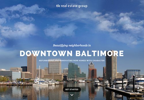
Another web design trend that is becoming more and more popular is parallax scrolling sites. This technique grew out of the multiplane camera technique used in traditional animation and made popular by 2D computer graphics and video games. One example is the 1982 arcade game Moon Patrol.
Some examples of great parallax scrolling sites are:
Grid Layout
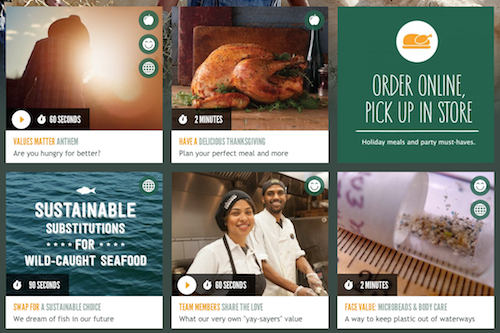
What Pinterest started, web designers continue with grid-like layouts. The grid layout creates a user experience that is great for tangible product based businesses. This layout allows users to easily view each item one by one in a very structured and logical way. Check out Wholefoods’ grid layout for their site below.
Emphasis on type
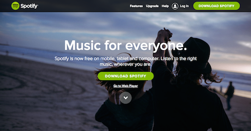
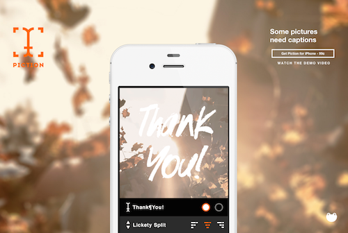
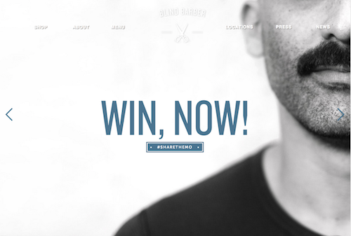
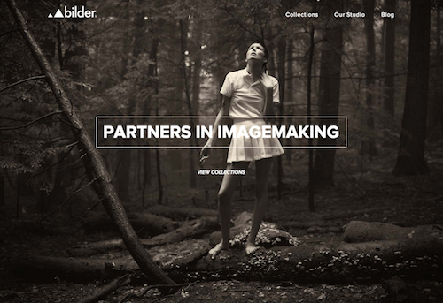
A couple typographical trends that emerged (or continued) in 2014 were handwritten fonts, mix and match type, and large type. Paired with a full screen background image or video, large type is gaining traction and will continue in 2015.
Ghost Buttons
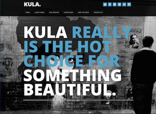
Something we’re seeing a lot of this year are ghost buttons. Yet another design element made mainstream by IOS 7, “ghosty” design is something seen regularly in Hollywood, from Star Trek to Ironman, minimal and thin = futuristic.
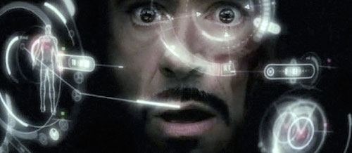
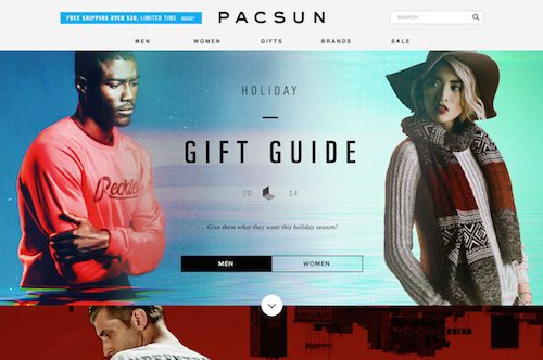
Here are some sites with examples of ghost buttons:
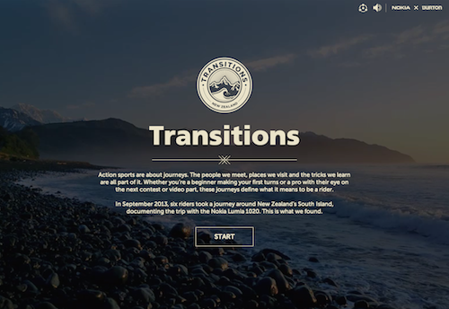
Ghost buttons work especially well when the only action required is the one that the button offers. For example, using “Start” as the call to action makes the ghost button the focal point, creating a great user experience.
SVG Images and Icons
Another up-and-coming web design trend for 2015 is the use of SVG (scalable vector graphics) images and icons. SVG is an XML based vector image format that is supported in all browsers except IE < v9 and Android < v3. In laymans terms, SVG is basically taking a vector image that you created in a program like illustrator or Inkscape and, instead of saving it as a .png or a .jpg, saving the vector image you created as SVG code. When placed where you want it, the browser will then read the code and your image will appear. Learn more on css-tricks.com.
Pros
- SVG graphics do NOT lose any quality if they are zoomed or resized
- Every element and every attribute in SVG files can be animated
- SVG is a W3C recommendation (and has been since 2011 despite underuse)
- SVG images can be printed with high quality at any resolution
(More pros)
Cons
- If your design must be rendered in IE8, you must either provide another vector fallback (such as the more convoluted VML) or not use vector at all, and instead rely on responsively sized images.
Concerns (Why you probably aren’t using SVG)
SVG documents look complex. What designers need to know is that they do not need to edit the code. Edit the image in Illustrator, Inkscape or another program and save the code. You’ll never need to edit point by point! Read more on Code.Tutsplus.com.
2015 and beyond
These web design trends will become commonplace for 2015. Don’t let your site design go out of style! We can’t wait to see what the future holds for design in the coming year!

2 Comments
Pingback: Canoe Graphic Design – Boat Building
Pingback: What Does a Great Homepage Look Like? - ReEnvision Inbound Marketing - US