Recently, my team and I were reminiscing about the personal and professional wins and challenges of the year (and there was much to discuss!). Of course, this led to a little trip down memory lane – the clients we have loved, the jobs that brought the most growth, and the lessons we’ve learned over the last 24 years (!!) of business. insight180 has had the pleasure of working with some amazing people, businesses, and brands. Throughout the years, we’ve seen many of these organizations change and grow as well, refreshing their brand with new websites, messaging, and logos. We’re no different.
We’ve tweaked and refreshed the insight180 brand several times, as a way to commemorate a shift in focus or celebrate a new chapter for the business. Each time, we’ve approached the process similarly to the way we would advise our clients if they were considering a logo refresh. Has it been more than five years since you’ve looked at your logo and messaging? Have your service offerings changed? Is your marketing serving you well? Is there a shift that you are preparing for that your clients need to know about? In each of these cases, ask yourself what are the strengths and weaknesses of your current brand and what opportunities might a brand refresh facilitate.
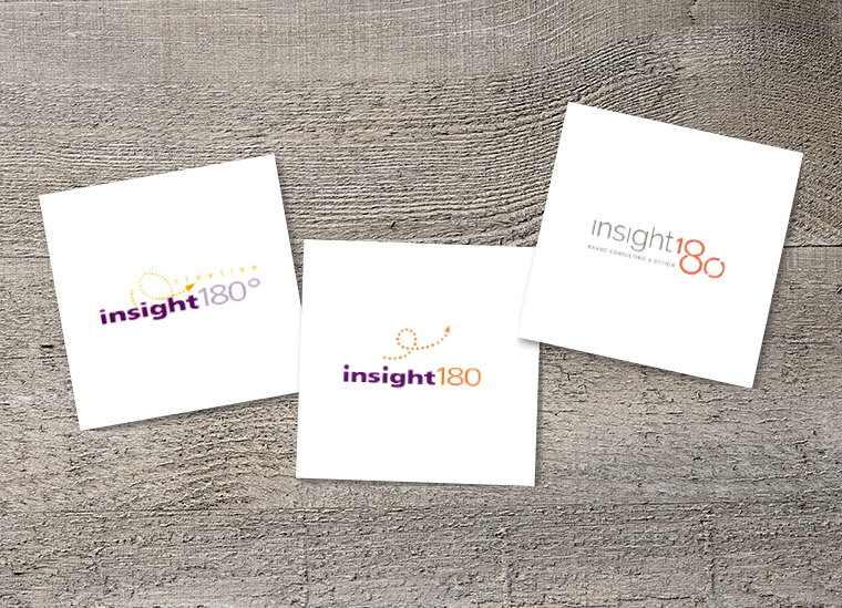
Here are three of the logos we’ve used over the years with a little of the why and how for each. We’re curious, do you see similarities of your brand in our story? If so, it may be time for a logo refresh.
Iteration #1: Focusing the Lens on Our Business Name

When first starting out in January 2000, it was important to us to differentiate ourselves from the other graphic design and communications firms in our area. We also wanted to spark conversation about ourselves. Our name, insight180 creative, did both of these beautifully.
“As the person who mostly met with new clients and provided creative direction, I got asked a lot about our name. ‘Why insight180?’ ‘Why not 360?’ So much of what we do is to guide our clients. We help them focus and clarify so that their business name and brand feels like a natural extension. So it’s important to dive deep into research, ask lots of good questions, listen, and observe. And, while ‘doing a 180’ can often mean an abrupt reversal, for us it’s more about taking a ‘pause…’, broadening or focusing the lens, and considering a potential new angle or direction. It’s the exploration of where you are when you pause and the consideration of where else you might like to be, rather than continuing to move around the circle and back to the beginning.”
– Wendy Baird, insight180 President
As you can see in the design of the logo, the dotted line starts off in one direction, reverses course, and then moves forward again. We also liked how it was whimsical, as if to say anything is possible when you work with insight180!
Iteration #2: Simplified for Clarity
 Five years into our business, we focused more on our firm’s unique niche, which spurred a logo refresh. After all, we were becoming so much more than just a typical “creative” firm. We’d begun to establish ourselves as brand experts in our community. With a slightly new direction we opted to refresh our color palette and simplify our logo. This change coincided with a new HTML website launch.
Iteration #3: Coming Full Circle
 About 10 years later, after our business managed to survive a devastating flood (the first of two that would strikein two years), it was time for a logo redesign. On July 30, 2016 a devastating flood took the quaint town of Old Ellicott City – insight180’s home for the previous 16 years – by surprise. The quick and unexpected “weather event” destroyed businesses andhomes with insurmountable rainfall, water damage, and flooding to the 100+ years-old buildings that lined picturesque Main Street. What followed were weeks of search and rescue, clean up, rebuilding, and letting go of what was lost to embrace the new beginning.
As the one-year anniversary of the flood approached, we decided as a team that we needed a fresh look to go with our newest chapter. Not only were we celebrating our strength as a small-business flood survivor, but we were also recognizing that there had been quite a few change-ups amongst our team, including the retirement of one of insight180’s co-founders.
“Having been displaced – and working for months from my home basement – shook us out of our routine, which helped us focus on what’s really important. We had more clarity about what we do and how we serve. I think Lao Tzu said something about finding the divine in the disruption. We rediscovered the joy, meaning, and purpose that insight180 was meant to bring to the world. And we re-established our connection with our core values – service, beauty, and delight being among them.”
– Wendy Baird
This time, we opted for a completely new look versus a small change to our logo’s design. We revamped the color palette of our brand, incorporating grays, orange and blues as opposed to hues of purple, and we circled in on our expertise – something we felt was important to clarify given the exit of one of our principals at the time. From a design perspective, we knew that we wanted an updated, fresh, crisp look indicative of a new chapter, hence our current logo was born.
And, while we love the logo we have now, it doesn’t mean we won’t decide to tweak it down the line. After all, you never know what the future holds.
If you’re considering giving your logo a refresh, reach out to team insight180. We’re here to help offer a fresh perspective. Contact us today!

