As branders, we love watching brands evolve, grow and take charge. How a rebrand unfolds, and the reasons behind it, is intriguing at least. And done well, a rebrand can make a big difference in fan loyalty and market share. Two very popular consumer brands officially announced brand updates within days of each other, and while “rebrand smackdown” may be a slightly exaggerated way to refer to it, we think it could be fun to compare notes for these two established, consumer-facing brands.
So, why would two-decades-old companies like Dunkin’ Donuts — now Dunkin’ — and Weight Watchers — now WW — choose to rebrand? And what effects will their rebrand mean to their loyal and prospective customers?
Dunkin’
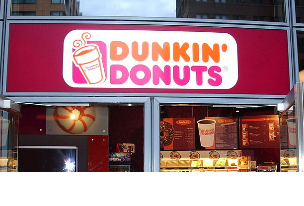
The self-proclaimed “#1 retailer of donuts in America,” Dunkin’ Donuts, announced plans to rename to Dunkin’ starting in January 2019. The donut empire is dropping “donuts” from its name to show that they have more options than just donuts on their menu. In fact, beverages make up 60 percent of their sales today! Ultimately, their goal is to narrow their focus on their coffee and become more competitive with coffee empires in the nation (i.e. Starbucks). The Canton, MA-based Dunkin’ Donuts dominates the coffee market in the Northeast and has aspirations of becoming an even larger national player. The company has been testing their potential rebrand in some cities since the spring of 2018 and received positive feedback from customers about their rollout.
Pros and Cons
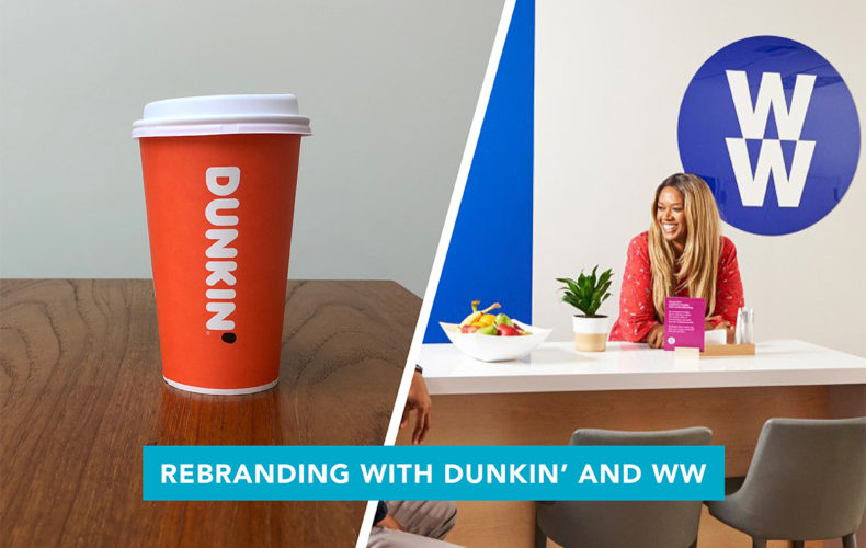
We think the rebrand to Dunkin’ is a good move for the coffee chain. The logo will be similar to their old one — the signature bright pink and orange color palette adds brown and kraft paper elements to its containers and the font-style will remain the same — which is great for name/brand association. While dropping “donuts” makes the name a bit more opaque, Dunkin’, according some of its brand loyalists, has always been more about the coffee. This change allows them to more easily expand their niche from a “donut empire” to a coffee chain with many other breakfast options. We also like that the name is going to match their 10+ year old slogan “America Runs on Dunkin’.” While other loyalists will mourn the loss of the word donuts, we still believe this is a relatively safe bet and a fun refresh.
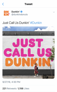
But what about that apostrophe? Here it’s used to replace the “g” that would normally end the word, dunking. We like it. In the Northeast, the franchise is often referred to as Dunkies or Dunkin’ already. And shortening a name from four syllables to two is a good thing (people always look for opportunities to shorten, and we much prefer this to initials). Using the apostrophe as a graphic element (below in a different color than the letters), provides some fun brand play opportunities.


WW (Weight Watchers)
Weight Watchers has slimmed their name down to the initialism, WW. CEO Mindy Grossman wants to emphasize the company’s focus on overall wellness, not just weight loss and diets. Although announced just recently, the rebrand will be rolled out in phases. Along with the shortened name, the company added a slogan “Wellness that Works” and a new program WellnessWins to their new brand. Oprah Winfrey, who purchased 10 percent of the company in 2015 and serves as an ambassador, is also on board with the rebrand and has worked on this refresh along with the company. Oprah is an asset to the brand, for sure.
Pros and Cons
The name change and new focus on wellness over weight loss seems valiant (and perhaps more politically correct). It initially feels like a safe bet, but we have some concerns. Many people across the country are looking to improve their overall wellness; it’s about health, not just losing weight. On the pro side, that means the company’s customer-base may expand and become more diverse. Their audience of mostly women may now have a greater appeal to both men and women.
Here’s the thing. As branders, we often warn clients about the dangers of acronyms. The public, media and the companies, themselves, always look for shortcuts, particularly now that younger generations have brought texting abbreviations like LOL, OMG and BRB into the mainstream. However, this can be dangerous for a new or expanding brand, particularly when the letters can stand for so many different things. For example, in a Google search, WW automatically wants to add a third W and visit your favorite website. World Wide (Web) comes to mind if not the beginning of World Wrestling Federation.
Let’s talk about mouthfeel. Simply, mouthfeel is how easy or satisfying (or not) it feels to say and experience a word or name as one says it. Weight Watchers is two words, alliterative, easy to say and just three syllables. By contrast, saying the initials: double u, double u, while somewhat alliterative, “doubles” the syllables. Maybe it gets shortened (which is our tendency to do) to “dubya, dubya” or “dub, dub” but that introduces more confusion. Any other letter in the alphabet would be shorter and sweeter, in terms of mouthfeel.
As for the logo, the jury’s out. Honestly, the Weight Watchers brand was known more for the meetings, the results, the points and the plan (and maybe Oprah). The logo mark and colors are not as memorable or in the public eye like a coffee shop. We get it. At a time when diets are culturally scorned, the company whose very existence depends on overweight women who repeatedly “fail” in their diets needs to de-emphasize the “weight” in Weight Watchers to prevail/survive/succeed. Weight Watchers changing their name to WW is their attempt to keep up with today’s standards of health and wellness, without the focus on weight. There’s a lot more to this than any rebrand can hope to sufficiently address.
Is WW trying to do too much at once? Maybe.
And as far as the logo goes — two stacked Ws reversed out of a solid circle — we feel like we’ve seen this before. It will be interesting to watch how the rest of the rebrand plays out.


Are you thinking of doing a brand refresh, but don’t know where to begin? Contact us. We will be happy to help guide you through your next rebrand!

